Happy π Day!
Here's a pie chart of how pie charts are called worldwide. Did you know they are called "Pita diagrams" in Greece, "Camembert diagrams" in France, 🍕 "Pizza graphs" in Portugal, and "Cake charts" in China and Sweden? In fact, a quarter of the world uses the word "cake" while another quarter uses words like "round" or "circular" to describe it. Such is the case in all the Spanish-speaking world.

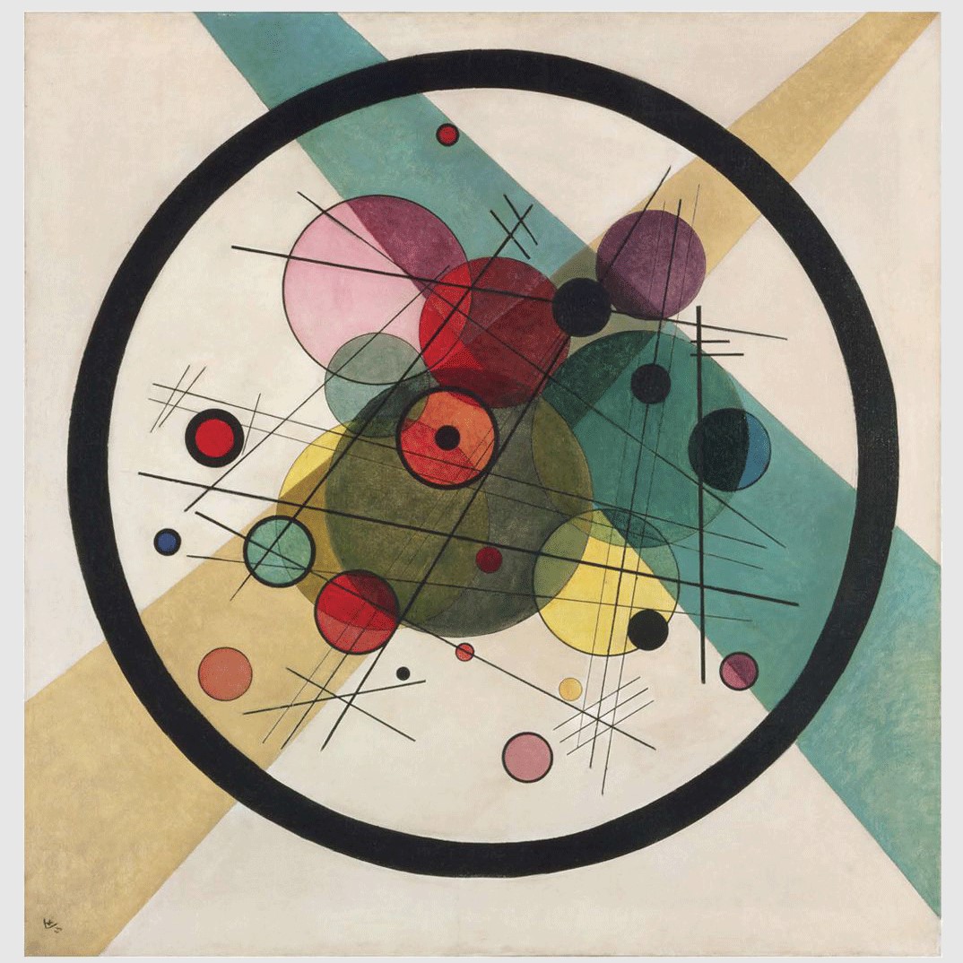
Featured image by: Vassily Kandinsky (1923) titled "Circles in a Circle" retrieved from Wikimedia Commons
🥧 Yet, pie is still king, but I suspect it's only because the British Empire once held sway over 23% of the world's population. Then, in the 20th century, the United States has propagated English terms further, as some regions were starting to adopt statistics. Perhaps more imaginative and more localized terms would describe a pie chart otherwise.
Data visualization embodies cultural considerations and preferences, from colors to shapes to proportions. And I think this extends to the language used to communicate about it.
What do you think? Is there something to interpret? What is your favorite term?